Skip to content

- Blog
- Uncategorized
- Visualizing and Managing Large Datasets with Apache ECharts and AG Grid Tables
Visualizing and Managing Large Datasets with Apache ECharts and AG Grid Tables
Organizations are capturing and analyzing increasing amounts of data to power ML and AI and generate actionable insights. However, for this data to be useful, it needs to be processed and interpreted. To this end, effective visualization is essential — yet traditional tools and methods are not sufficient to handle the scale of data regularly processed by organizations innovating in the trenches of today’s tech landscape.
At nOps, where we oversee $1.5 billion in cloud expenditure, managing and visualizing today’s hypermassive datasets demanded a revamp of our React applications’ tools and methodologies.
In this article, we’ll focus on the innovative technical strategies driving our success in reducing latency and enhancing performance for data visualization at scale. We’ll explore the technical hurdles involved, the cutting-edge libraries and tools we’ve leveraged, and insights from our experience building highly efficient and intuitive cloud cost dashboards to help our users understand terabytes of their cloud data.
Managing Large Datasets in React Architecture: An Overview
Complex charts and dynamic filters are crucial for effective data visualization and manipulation, but the large quantities of data involved pose challenges when it comes to management and efficient rendering. At nOps, we focus on three main strategies to address these challenges:
Advanced Customization, Memoization and Scalability.
Advanced Customization allows us to tailor tools to our specific needs, improving efficiency and usability. Memoization is a cornerstone technique for optimizing performance and preventing unnecessary re-renders by caching expensive calculations and components.
Scalability ensures that our tools can handle the increasing volume of data without compromising performance.
Our dashboards are constructed around two key components: charts for visualizing data and tables for structured data display. Let’s explore each as real world use cases demonstrating the use of advanced customization, memoization and scalability.
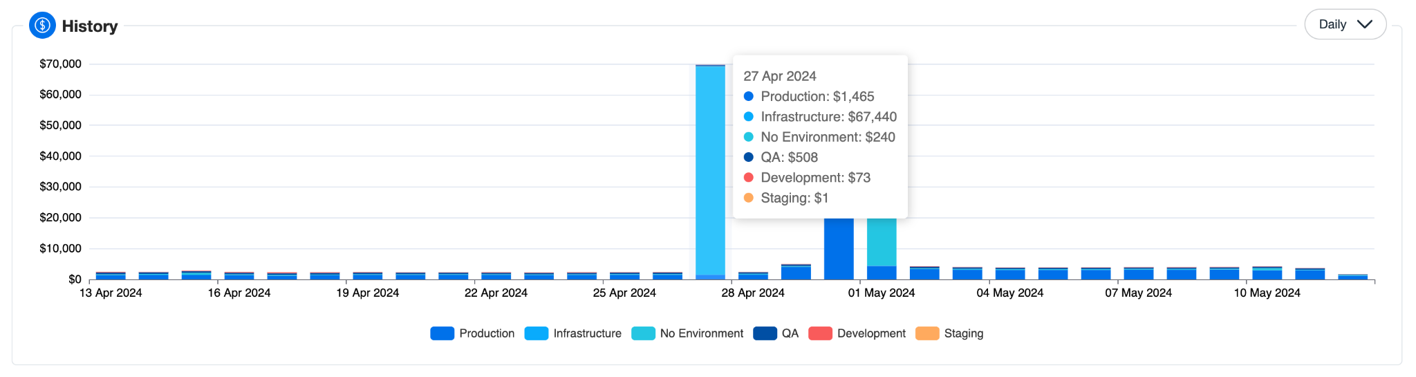
Building Data-intensive Charts and Graphs with Apache ECharts
To manage large datasets, we have adopted Apache ECharts, a powerful yet simple open-source JavaScript visualization library. Many organizations struggle with finding tools that can handle extensive data while maintaining high performance. ECharts, with its comprehensive documentation, powerful customization capabilities, and superior performance with large datasets, emerged as the ideal solution for representing various aspects of cloud spending on our data-intensive dashboards.
Without Apache ECharts, replicating the same level of functionality and performance would demand significantly more resources.
In the following sections, we will discuss how we have implemented Advanced Customization, Memoization, and Scalability to enhance performance and usability.
Advanced Customization:
Apache ECharts offers a high degree of flexibility and support of various chart types, allowing us to expand, style, and customize it to align with our specific visualization requirements. To integrate ECharts within our React application, we have utilized the ‘echarts-for-react‘ wrapper, which encapsulates ECharts within React components, ensuring seamless integration and adherence to the React paradigm. It manages the lifecycle of the ECharts instance, enabling advanced customizations by guaranteeing accurate rendering and updates.
We have leveraged this feature to infuse our design style systems, ensuring a consistent look and behavior across all our charts and enhancing visual coherence and usability.
Memoization and Performance Optimization:
One tool that is pivotal to our approach is Redux Toolkit, which helps reduce boilerplate code and streamline state management in React applications.
We have created slices using Redux Toolkit for storing and managing changes in chart datasets. These slices act as a single source of truth for our data, ensuring consistency across the application. Example:
import { createSlice } from '@reduxjs/toolkit'; const chartSlice = createSlice({ name: 'chart', initialState: { data: [], filters: {} }, reducers: { setData: (state, action) => { state.data = action.payload; }, setFilters: (state, action) => { state. filters = action.payload; }, }, }); We use memoized selector functions to compute derived data from our Redux store, enabling efficient data retrieval and reducing unnecessary renders. These selectors re-run computations only when the input state changes, enhancing performance.
Before passing data to our charts, we preprocess it through aggregation techniques like computing averages, totals, or counts. This condenses the data into relevant summaries, reducing the volume rendered and easing the browser load. We also filter out irrelevant data points during preprocessing, displaying only pertinent information to streamline the user’s analytical focus, optimize the rendering process, and further reduce the browser’s computational load.
import { createDraftSafeSelector } from '@reduxjs/toolkit'; const selectChartState = (state) => state.chart; const selectChartData = createDraftSafeSelector( selectChartState, (chartState) => chartState.data ); const selectFilteredChartData = createDraftSafeSelector( selectChartData, (state) => state.filters, (data, filters) => data.filter(item => filters.includes (item.category)) ); Leveraging React’s virtual DOM offers substantial performance benefits in rendering complex charts. React’s React.memo is particularly useful here, allowing for comparison of props and state to ensure components only update when truly necessary:
const MemoizedChart = React.memo (Chart Component);
By leveraging the power of Redux Toolkit, memoization techniques and strategic data preprocessing, we were able to supercharge the efficiency of our data management for a smooth and responsive user experience.
Scalability:
Advanced Scalability empowers developers to refine their charting solutions for enhanced behavior and aesthetics. One way to achieve this is by using custom hooks, such as useChartDataTransform, for dynamic data fetching. This encapsulates the logic for retrieving, processing, and delivering data to charts, ensuring the data is optimally formatted for visualization and performance.
In this context, Redux Toolkit’s createAsyncThunk function plays a crucial role. It allows us to handle asynchronous data fetching within our Redux store, automatically dispatching actions at different stages of the data fetching process. This simplifies the management of loading and error states and integrates seamlessly with our custom hooks.
This approach not only streamlines data handling but also promotes code reusability and enhances modularity across the project, contributing to a more maintainable codebase.
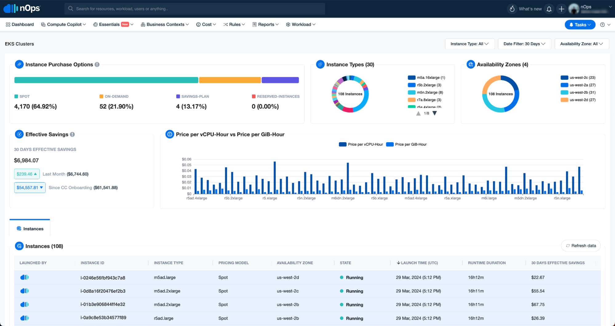
Building Data-Intensive Tables with AG Grid
While charts and graphs provide a quick overview, detailed breakdowns require the use of tables. At nOps, we’ve chosen to use AG Grid. Here’s why we chose it and how we leverage it.
Advanced Customization:
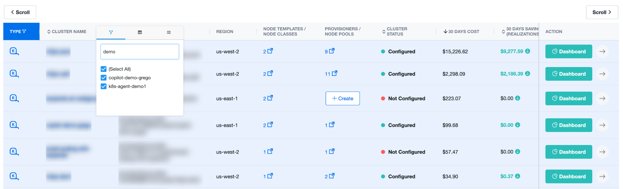
AG Grid is a feature-rich data grid that stands out for its extensive capabilities to display massive amounts of data without overwhelming the user. It supports sortable and filterable columns, allowing users to easily sort and filter different metrics such as savings, total cost, or cost over time. It also supports column resizing, pinning, and various table actions, providing a highly customizable user experience. Moreover, Ag-Grid’s theme styling allows us to maintain a consistent look and feel across our platform.
AG Grid is designed to handle large amounts of data without compromising on performance. This is a significant advantage over other libraries that may struggle with large data volumes.
We’ve also leveraged the ag-grid-react wrapper, which allows us to seamlessly integrate AG Grid within our React application. A hierarchical structure can be used to show costs broken down by department, project, or any other relevant category.
Memoization and Performance Optimization:
To manage our Ag Grid tables, we use memoized selectors to efficiently retrieve derived data from our Redux store, reducing unnecessary renders re-running computations only when the input state changes.
Additionally, we optimize performance using React’s useMemo hook to cache table data based on filters or actions. This ensures expensive calculations are only performed when dependencies change. Here’s an example of how to use useMemo:
import React, { useMemo} from 'react'; const AgGridTable = ({ data, filters }) =>{ const filteredData = useMemo (() = => { return data.filter(item => filters.includes (item.category)); }, [data, filters]); }; // render ag-Grid table with filteredData Another approach to memoization with AG Grid tables could involve the use of the useCallback hook from React. This hook returns a memoized version of the callback function that only changes if one of the dependencies has changed.
For instance, if you have a function that formats or transforms the data before passing it to the AG Grid table, you could use useCallback to memoize this function. This ensures that the function is not recreated on every render, but only when its dependencies change.
Here’s an example:
import React, { useCallback } from 'react'; const AgGridTable = ({ data, filters }) => { const transformData = useCallback((data) => { // Perform some transformation on the data return transformedData; }, [filters]); const transformedData = transformData(data); // render ag-Grid table with transformedData }; Scalability:
Ag Grid is a highly scalable library that can handle large amounts of data efficiently. Here are some concise examples of how we leverage its features for advanced scalability:
1. Server-Side Operations: Ag Grid allows operations like sorting, filtering, and grouping to be performed on the server. This is particularly useful when dealing with large datasets that would be inefficient or impractical to load entirely on the client-side.
const gridOptions = { rowModelType: 'serverSide', // define server-side operations handlers onGridReady: params => { const serverSideDatasource = { getRows: (params) => { // make a request to the server with params.request // call params.successCallback (rows) when data is received } }; params.api.setServerSideDatasource (serverSideDatasource); } }; gridOptions.api.batchUpdateRowData({update: [row1, row2, row3]}); const gridOptions = { groupUseEntireRow: true, groupDefaultExpanded: -1, groupRowRenderer: 'myGroupRenderer', groupRowInnerRenderer: 'myInnerRenderer' }; nOps makes it easy to visualize & optimize your cloud costs
We hope you’ve found this discussion of practical techniques for data management at scale to be useful. At nOps, we’ve embodied these principles in a tangible product enhancement to help our customers effectively visualize and manage their dynamic granular cloud data.
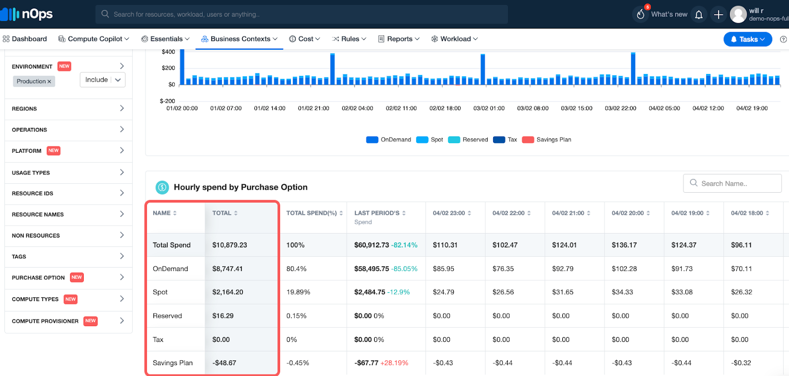
nOps’s free cloud cost management tool, Business Contexts, gives you complete cost visibility and intelligence across your entire AWS infrastructure. Analyze and allocate your cloud costs by product, feature, team, deployment, environment, provisioner, purchase option, compute type, or any other dimension.
For sample use cases, from seeing how much of your Reserved Instances you’re wasting to pinpointing the spike in your cloud bill, check out this recent guide by the nOps Data Engineering team.
Besides making it easy to understand and allocate 100% of your AWS bill, nOps also offers a suite of ML-powered cost optimization features that help cloud users reduce their costs by up to 50% on autopilot, including:
- Compute Copilot: automatically selects the optimal compute resource at the most cost-effective price in real time for you — also makes it easy to save with Spot discounts
- Commitment Management: automatic life-cycle management of your EC2/RDS/EKS commitments with risk-free guarantee
- nOps Essentials: set of easy-apply cloud optimization features including EC2 and ASG rightsizing, resource scheduling, idle instance removal, storage optimization, and gp2 to gp3 migration
nOps processes over 1.5 billion dollars in cloud spend and was recently named #1 in G2’s cloud cost management category.
You can book a demo to find out how nOps can help you start saving today.